“Need help…?”
Choosing a colour scheme for your kitchen can be the most exciting part of your kitchen design, but can also be very daunting. You have to live with the colour for quite a long time, if not forever, so you want to choose a colour scheme that suits you and your personality, that you will love for years to come.
Don’t worry if you are not sure on what colours to choose from, or you have never looked in to colours for your kitchen before, as in this article I will show you what you need to know on designing your kitchen’s colour scheme, the rules and how enjoyable it can be, being creative with your hub of the home.
Lets get started!
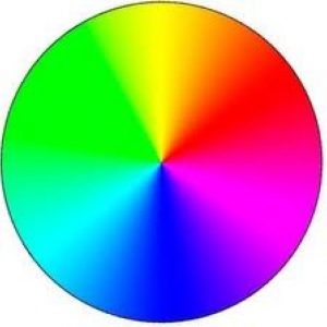
Thinking about interior design, there are three basic colour schemes: Tonal, Harmonious and Complementary.
Tonal… Choosing a base colour and using variations of the colour around the room. Works perfectly with contemporary kitchens.
Harmonious… Look at a colour wheel and choose colours that are close to eachother. Complement them without being too similar. Purples, pinks, yellows and greens.
Complementary… It is a much bolder approach that uses opposites to create a statement in the room, such as a monochrome design.
You want to look at ways that will suit you as well as your personality. So if you are quite a quiet person, how about looking at a tonal colour scheme. This will add a soft, elegant feel, but also create a great design for the room you spend the most time in. Inject some fun in to your kitchen with different patterns using the same tonal shade. If you are quite a loud person, maybe look at a complementary colour scheme. Being loud is not a bad thing as your personality can be brought out in your decor. Make a BIG IMPACT! Lots of people create their own colour schemes, so it is not strict on what colours to go for.
Think about how you feel when you are in your kitchen. Personality plays a huge role in decor and design, and is totally down to personal choice. Colours are strongly associated with different moods and things.
A lover for nature? Then a green is perfect. It is a calming and refreshing colour that seems to be very popular in kitchen’s today.

A lover for the seaside? Blue creates a peaceful and tranquil design.

Always happy? A yellow is a happy colour that brightens up anything!

Lover for luxury? Purple is a sophisticated colour, that is also romantic.

Energetic? A red relates to a faster heartbeat and the word L.O.V.E. Red is an extreme colour and will definitely make your kitchen stand out.

Powerful? A black is a timeless design and very stylish.

Love all things bright? White reflects light and brightens up the space. Small kitchen? White is perfect to open up the space.
Once you have an idea on what colours you want to use in your kitchen design, you can start to think where you are going to place them. Different shades look different in different locations, so it does depend on the size of your kitchen and the layout.
Small Kitchens…
For a small kitchen it’s best to stick to lighter colours. This of course doesn’t mean that you can’t add dark elements, but always balance them against pale surroundings. Dark flooring and worktops can be contrasted against lighter coloured cabinets and walls to create an open feel, or use a light flooring and worktops with a dark coloured cabinetry.
If you want a feature to stand out, how about adding colour to this. Too many colours may not work. Light and dark colours need to be balanced. Use a vibrant colour maybe on the worktops or backsplash.
Medium and Larger Kitchens…
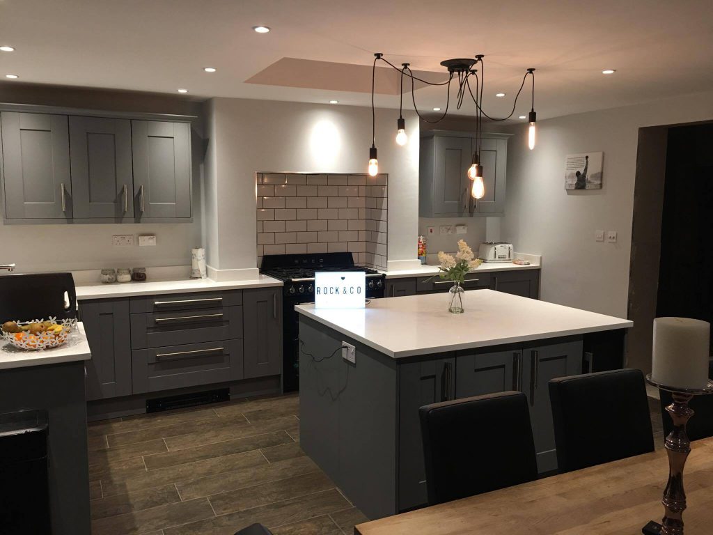
Big kitchens tend to have more flexibility for colours. If you are lucky and have lots of natural light entering the kitchen, use a dark coloured cabinetry for a striking display. Create your own colour palette with tonal or harmonious colours that will make you feel good in your kitchen. If you have a kitchen island make this your statement piece by adding lots of vibrant colours.
Take a look at some of our customers colour schemes. Some have been very daring…
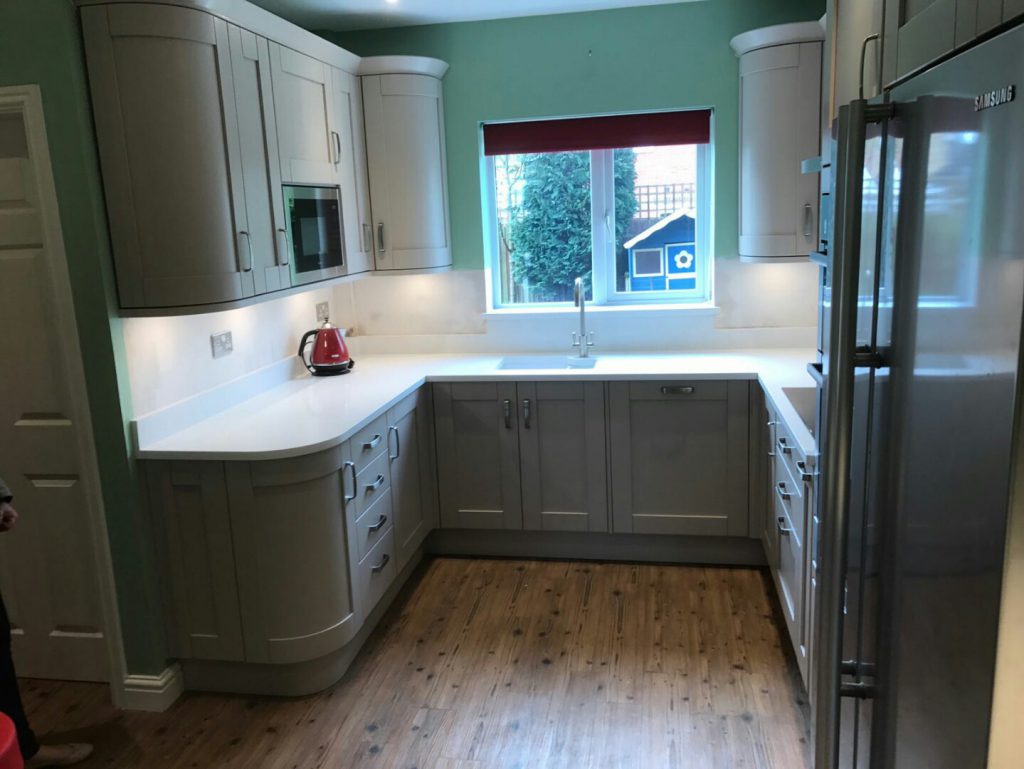
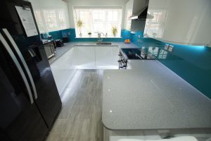 I love this colour scheme. Grey, white and blue. The worktops installed into this kitchen is the Grigio Medio Stella. It is a medium style grey quartz with sparkles throughout.
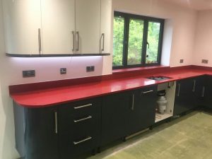 Look at how daring this customer is. Featuring the Rosso Stella style quartz.
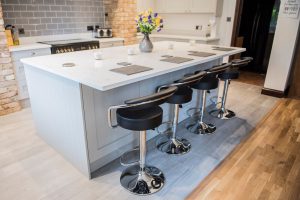 How beautiful. A great contrast with the Carrera style quartz.
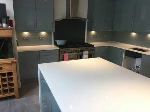 This is a traditional style kitchen with the Bianco De Lusso style quartz installed on the worktops.