As we are fully into the Spring season and Summer is coming, why not take a look at the design trends that will dominate our homes in 2017.
A New Year means new fresh colours!
Read on to find out the colour trends you need to know about in 2017 as well as the COLOUR OF THE YEAR and how to style it into your home.
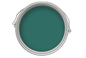
Nature Greens
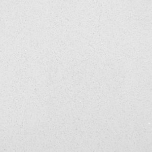
Today many people are becoming increasingly interested in the outdoors and connecting their everyday life with nature. What better way to get a green fix than with a rich, lush, foliage palette that will create your home in to a tranquil look. Create this kitchen colour scheme with plenty of greenery and indoor planting to really bring the outdoors in. You may want to opt for green cabinetry too to really show off your love for green and why not choose our perfect Bianco De Lusso Quartz to balance the greens and give a contemporary feel, making that work top steal the show.
Top Colour Picks from Dulux
- Fortune Green
- Tumbled Grass
Pastel Perfect
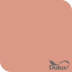
Sugary-sweet looking pastels have been given a beautiful makeover in 2017 and they are hotter than ever. Add a punchy pastel shade to lift the colour as well as give a twist to the room and create a fun, playful space that works for all the family, as well as be the envy of all your guests. This could be the perfect colour palette for your kitchen space and why not team it with our Blanco Real Granite to set the conversation going.
Top Colour Picks from Dulux
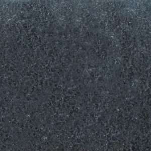
Layering Tones (bringing the seaside in)
This is when varying shades of the same colour are used together to create a tone on tone combination. By using these colours you can create a look that has a calm and harmonious feel as well as being modern. Using grey-blues can create a feel of sea air and make the space feel spacious, so you really do feel like you are at the seaside. The colours are perfect for the kitchen space and using our Diamante Black granite will certainly show off your love for the seaside as well as a starry night sky pallet that is perfect for when the sun is setting.
Top Colour Picks from Dulux
Bringing out the best in how the space is used
Paint techniques and clever layouts can be used to distinguish between work and play. It can help create the space as more multi-functional, and by using a calm toning pallet of colours this can physically separate the room and show your balance of every day life. Use a tone on tone combination in the kitchen and brighten up the eating area with a pop of colour distinguishing between the two. Maybe opt for our stylish Rapide granite to set the mood, balance the colours and catch the eye of the guest.
Top Colour Picks from Dulux
Nautral Hues
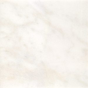
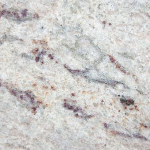
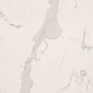
Your home should be a sanctuary, where you can escape to that’s calm and relaxing. Natural colours are perfect for the kitchen, as they will give that versatile look as well as a natural palette that anything goes with. Opt for our Mocha Quartz that will certainly bring a natural hue to the space and match in with everything or go different with our Calacutta. A neutral palette allows beautiful materials to take centre stage and stimulate senses.
Top Colour Picks from Dulux

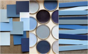
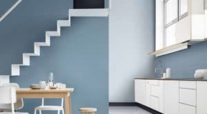
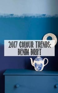
How to style the colour of the year Denim Drift…
The colour of the year from Dulux is Denim Drift and why not be inspired by us to try this out in your home as well as purchasing the perfect granite worktop. It is certainly a relaxing colour and varies between a blue and grey depending on the light and time of the day. Just think of your favourite pair of jeans that goes with anything. It’s a real classic shade that looks great in any room especially the kitchen.
Denim Drift forms a palette of 10 colours that all complement each other and works well in your home.
- Earl Blue
- Woad Walk
- Cobalt Night
- Marine Waters
- Cornflower Bunch
- Denim Drift
- Clock Face
- Sash Blue
- Indigo Shade
- Borrowed Blue
Style 1 – Ombre Sky
Ombre effect creating a blue sky that brings an instant calm feel to the space. Use a dark shade at the bottom and work your way up to the lightest blue in the palette (Clock Face). The dip-dye of the ombre effect from the Denim Blue works so well and is just amazing.
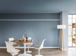
Style 2- Two Toning
Two tone to bring warmth and dept to any room. Keep a lighter shade on top to heighten the look of the ceiling and a darker shade on the bottom. Why not enhance the colour by choosing furniture the same colour to make the room appear roomier as well as avoiding any visual disruptions to the effect.
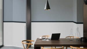
Style 3- Zoning
Contrasting colours can mentally separate the room to a multi-functional room. This is ideal for the kitchen, balancing the work areas to the entertaining areas. This is called “zoning” that will create juices flowing with the different colours.
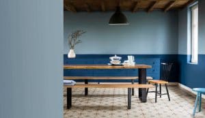
Style 4- Dapper Dado
The perfect opportunity to to get a little confident with colours is experimenting on Dado Rails (Cobalt Night). This allows you to work with dark and stronger shades. For a more contemporary spin why not use a darker shade on top like Denim Blue and a lighter shade on the bottom to carry out the two tone effect.
Style 5- Tonal-Layering
Create a calm and relaxing space with the colour of the year and embracing the hottest trend of 2017- tonal-layering. Use colours from the same family to create this look, and you don’t even have to stop at the walls, make use of the ceiling too. Neutral accessories are perfect for this but do choose accessories in the blues family to keep the restful mood going.
Style 6- Stripes
A striped feature wall is perfect to add a subtle interest to a calming, clutter free room. Using Denim Drift and Pocket Stone will really give off this effect and really show your stripe style.